Prostor, Educational Fair
Brand Identity
Prostor
July 2025
Mello
Project overview
Prostor is a one-day educational fair where school students meet 12 fields of knowledge and creativity, alongside people who live and work in what they love.
- For school students still figuring out where their curiosity leads
- For families who want to be part of that discovery
- For mentors and presenters looking to inspire the next generation
00 - Concept
After seven years of organising events, presenting, exhibiting, and designing for them, it became clear that education is usually communicated as either too sterile, too patriotic, or too naive. Prostor was built to prove otherwise: a design system with a human tone, room to grow across future editions, and materials clear enough that first-time visitors never feel lost.
-
The name itself is the concept. 'Prostor' is Bulgarian wordplay layered three ways: an open, free space, figurative room for ideas, and, colloquially, a washing line. That last meaning gave the brand its clothespin, along with its sense of humour.
The logo folds a clothespin, a lightbulb hidden in the negative space, and the letter П (for Простор) into one mark.
01 - Visual Identity
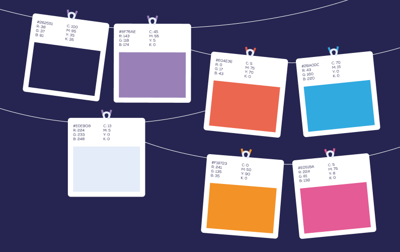
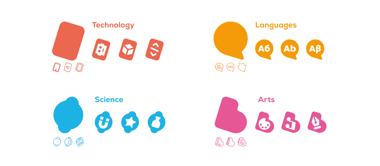
The colour system runs on two layers. A base palette of deep navy, muted purple, and soft periwinkle holds the brand together across all materials, while four category colours, one each for Technology, Sciences, Languages, and Arts, give every field its own immediately recognisable presence. Combinations are built on consistent proportions so layouts stay harmonious whether they use one category or all four.
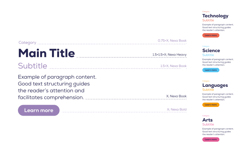
Typography is set in Nexa, a typeface by Bulgarian studio Fontfabric, chosen for its readability, range of weights, and full Cyrillic support. Nexa Heavy carries all headlines, Nexa Book handles body text, and size steps are built on a single base unit so hierarchy stays consistent across formats.
02 - Symbols & Characters
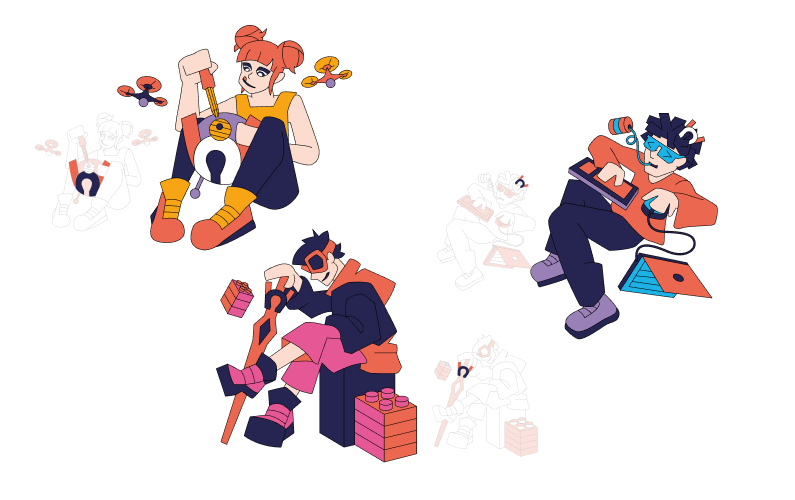
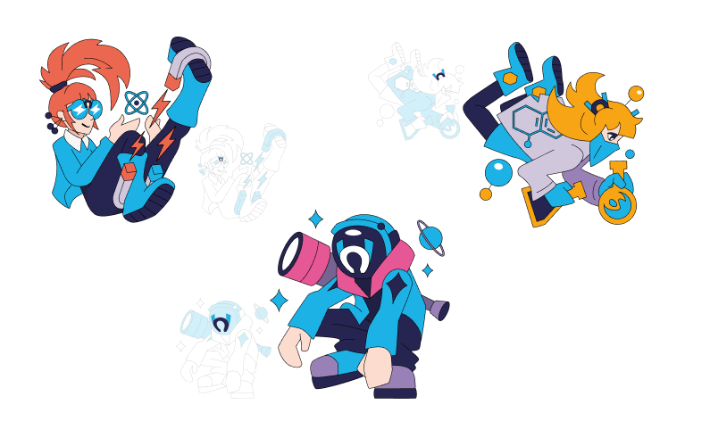
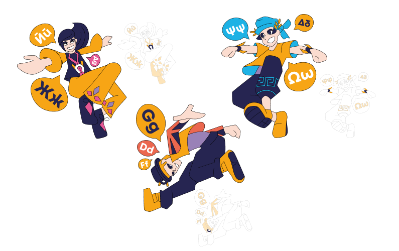
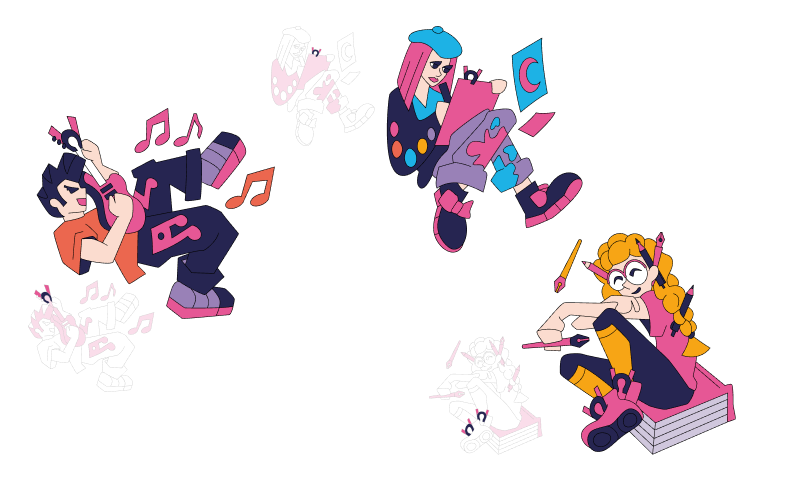
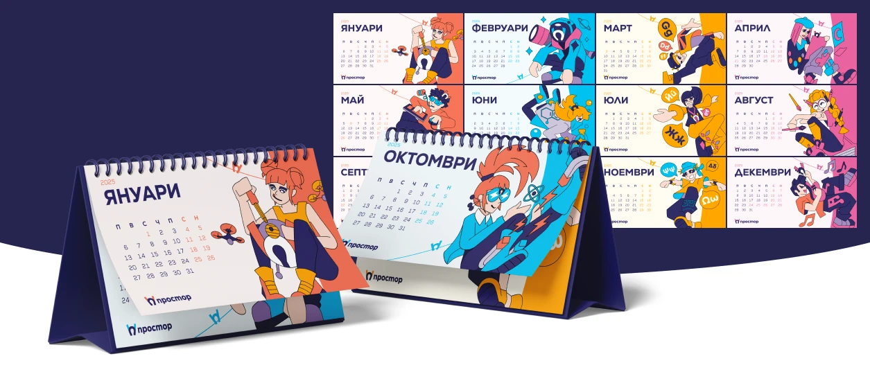
Each of Prostor's twelve fields, from robotics to Greek language to astronomy, has its own character, built from a shared set of rules rather than a single illustration style. Every character carries at least three details tied to their field, an equal split of men and women across the cast, and a nod to the logo's clothespin worked into the design.
Primary colours follow the character's own category, while secondary colours borrow from the others, so the full cast reads as one consistent world, even before anyone reads a name tag.
03 - Print Materials
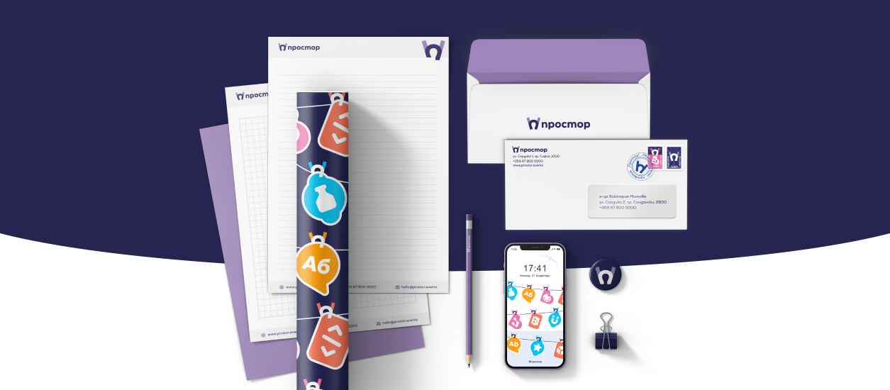
The launch campaign translated the same key visual across every print format the fair would realistically need: city lights, billboards, a mega-board, flyers, and web banners, all built around 'Discover your calling' with the clothesline of field tags as the hero image. Copy and category count scaled with the format, so the mega-board carries only what reads from a distance, while the flyer holds the full picture.
The brochure went one step further. A tri-fold with die-cut sections, it reveals a different visual composition depending on how it's folded.
04 - Event Materials
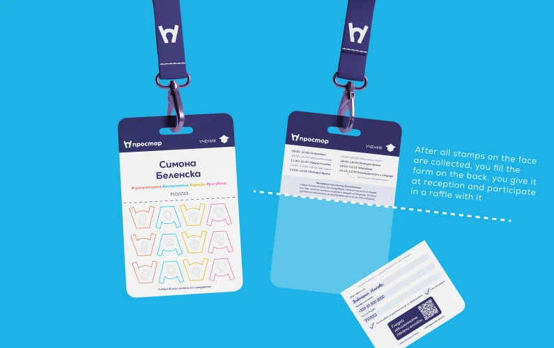
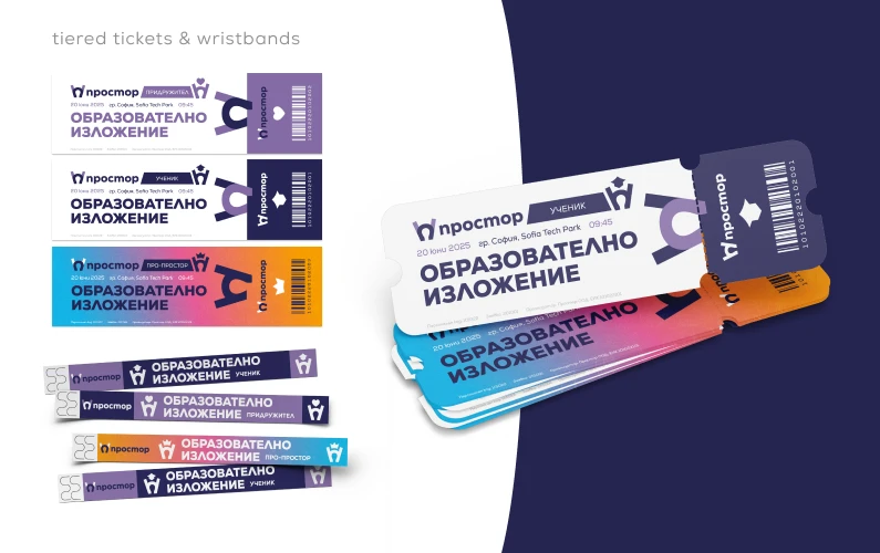
On-site materials needed to do double duty: identify each visitor and turn the day into something to complete, not just attend. Badges split into two parts: one side carrying name, category, and personal interests pulled from the registration form, the other built for collecting a stamp at every booth.
Filling the card matters: the stamped half tears off as a raffle ticket, handed in at the end of the day for a chance to win a prize, which conveniently keeps people on-site until closing. Tickets and wristbands follow the same colour-coding by visitor type: student, companion, or pro.

05 - Digital & Social
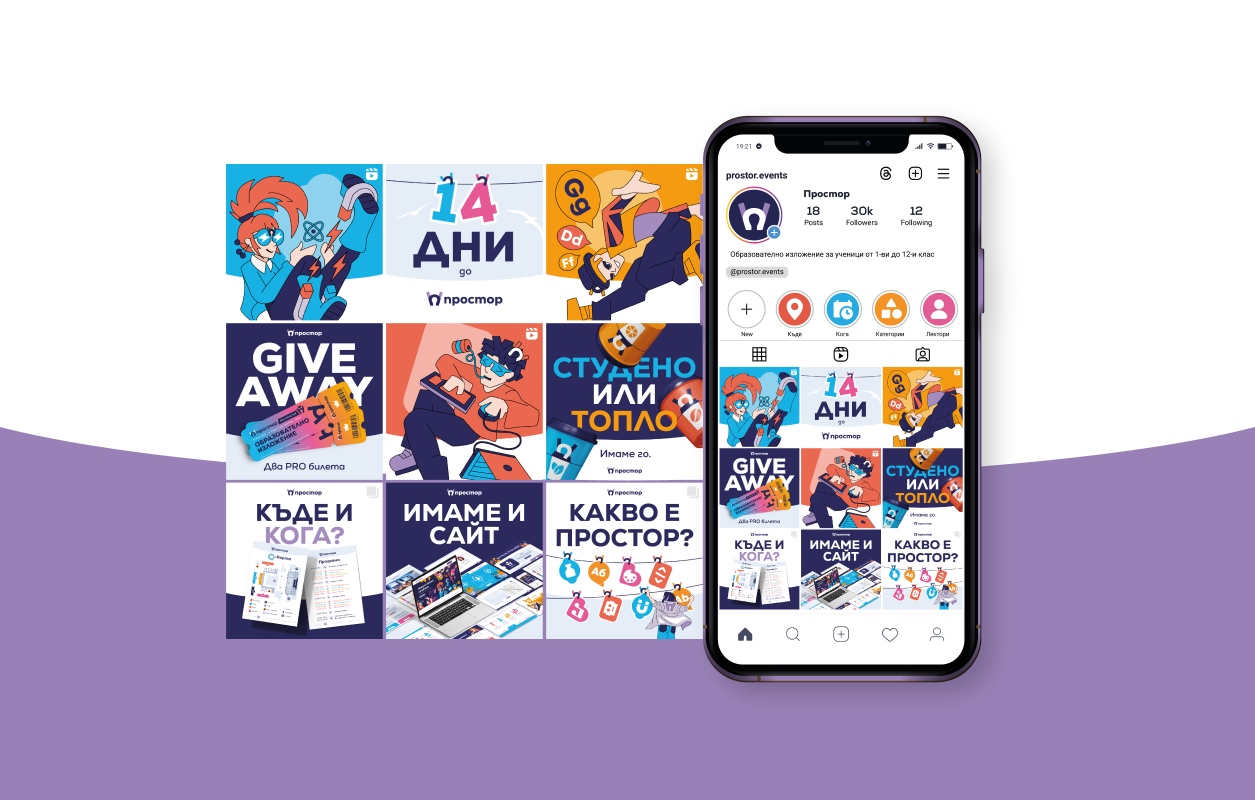
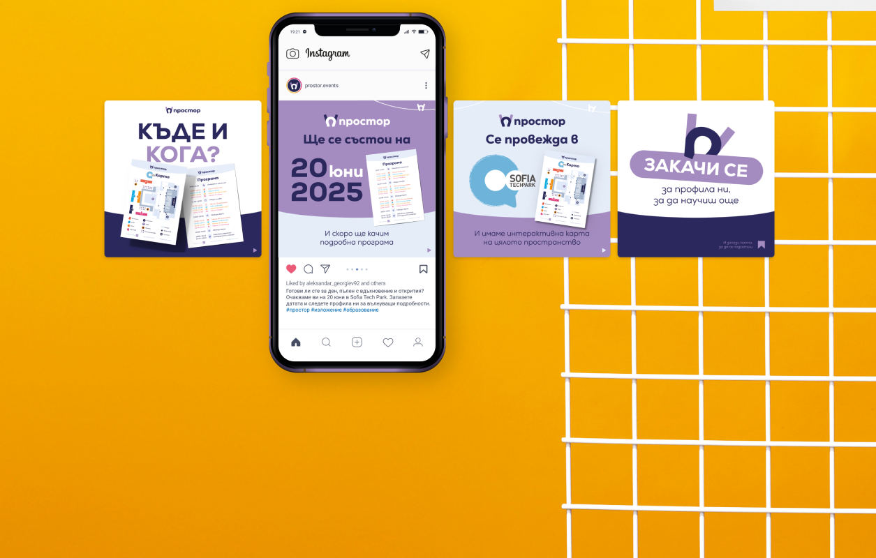
The campaign's digital presence ran on a countdown. Instagram grids and carousels teased giveaways, FAQs, and guessing games in the run-up to the date, all carrying the same line-and-tags visual from the key campaign. Facebook and email signatures kept the same system consistent wherever the fair showed up online.
06 - Website
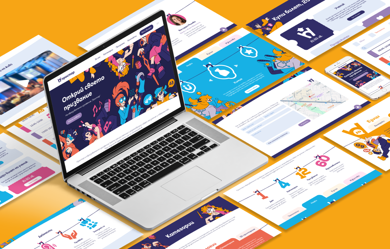
The website carried the practical weight of the project: information, a live programme, and ticket sales for student, companion, and pro passes, alongside an option to donate a ticket to a student who couldn't otherwise attend.
Prostor is, technically, a fair that doesn't exist yet, a self-funded concept built entirely for a diploma project. But the system holds together end to end, from logo to lanyard to landing page, and earned the highest grade on submission. Whether it ever runs for real is still an open question, though the project itself says it's certainly possible.
Personal
Feedback

Viktoria Mitova
Designer